Airbnb launched its new logo and rebranding campaign today. There are two videos below, the new logo launch and the comments by CEO Brian Chesky.
In his comments, Chesky said, “What has happened is, that over time, our community outgrew us -the brand. ‘Cause when people see Airbnb today –that are outsiders -they still see that little website that rents rooms, when what we do together is so much bigger.”
One of the guests in the video talked about his experience with Airbnb, ” No ‘Do not Disturb’ sign could create the kind of peace and serenity I experienced. In the mornings I would wake up, and I would have the sweet scent of incense burning, and I would meditate with my host…”
This isn’t a traditional vacation rental experience.
It is clear that Airbnb is not trying to replace HomeAway, FlipKey or compete directly with professional property managers. They are more interested in creating a new category than being a distribution outlet for vacation rentals as evidenced by:
1. Not engaging Professional Vacation Rental Managers
- Airbnb does not allow any technology integration with property management software systems, which makes it difficult for property managers to maintain updated availability and manage listings.
- Have not engaged with the professionally managed vacation rental industry which represents over half the short term rental market.
2. Prioritizing the rental of primary residences in legal battles
- Airbnb is pushing the legalization of rentals in primary residences, not traditional second home vacation rentals. When they are working on the ground to influence policy concerning short term rentals, they are not actively trying to protect professionally managed vacation rentals.
Comments online
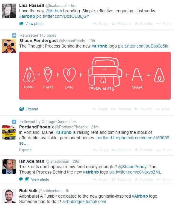
Here are some comments from social networks about the brand:


